Styling the forms
This is functional, but boring:
I found a few different color palettes for Zelda: Breath of the Wild and drafted up a quick stylesheet.
The first thing I did was the list of towers that you can discover. The raw HTML looked like this:
<label for="towers_hebra">
  <input id="towers_hebra" type="checkbox" name="towers[hebra]" /> Hebra Tower
</label>
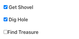
Which looks like this:
Booorringggg.
I want it to do two things: not see the checkbox, and invert the colors instead.
  label {
    transition: 0.5s;
    background-color: transparent;
    color: var(--color-cheese);
    border: 1px solid var(--color-cheese);
    padding: 0.5rem;
    max-width: 10rem;
    text-align: center;

    [type="checkbox"] {
      opacity: 0;
      padding: 0;
      margin: 0;
      width: 0;
      height: 0;
    }
  }

  label:has(:checked) {
    transition: 0.75s;
    background-color: var(--color-cheese);
    color: var(--color-dark-slate);
  }
Click it! Click the box!
A bigger challenge, how do I do a “leveling up” rank? The Great Fairy Fountains, in the game, can be levelled up from Rank 1 to Rank 4. Once you’ve passed a rank, you don’t need to go backwards, but you can only have one at any given time.
Initially I tried doing individual checkboxes for this:
<p>
  Misa:
<label for="zelda_botw_fairies_misa_1">
  <input id="zelda_botw_fairy_1" type="checkbox" name="fairies[misa]" value="1" /> Rank 1
</label>
<label for="zelda_botw_fairies_misa_2">
  <input id="zelda_botw_fairy_2" type="checkbox" name="fairies[misa]" value="2" /> Rank 2
</label>
<label for="zelda_botw_fairies_misa_3">
  <input id="zelda_botw_fairy_3" type="checkbox" name="fairies[misa]" value="3" /> Rank 3
</label>
</p>
That sort of works, except it would allow a user to tap Rank 1 and Rank 3, which would make no sense.
Then had another epiphany: Radio buttons!
A radio button will only allow one selection from its grouping.
<p>
  Misa:
<label for="zelda_botw_fairies_misa_1">
  <input id="zelda_botw_fairy_1" type="radio" name="fairies[misa]" value="1" /> Rank 1
</label>
<label for="zelda_botw_fairies_misa_2">
  <input id="zelda_botw_fairy_2" type="radio" name="fairies[misa]" value="2" /> Rank 2
</label>
<label for="zelda_botw_fairies_misa_3">
  <input id="zelda_botw_fairy_3" type="radio" name="fairies[misa]" value="3" /> Rank 3
</label>
</p>
Now you can only select one from the group.
Misa:
The rules I want it to follow are:
- Unavailable ones show as “red”
- Completed ones are shown as “green”
- The next available one (after the current level) shows as hollow, like above
To style this, I needed to use two CSS selector combinators: descendant and :has.
I also needed to add 2 additional options, before the others, indicating “Discovered” (rank 0, effectively), and a “reset” option (no rank at all). Radio buttons have this annoying behavior where once you pick one of them, you can’t un-pick anything.
I’m also going to make it into an ordered list.
<p>Misa</p>
<ol class="ranks">
  <li>
    <label for="zelda_botw_fairies_misa_reset">
      <input id="zelda_botw_fairy_1" type="radio" name="fairies[misa]" /> Reset
    </label>
  </li>
  <li>
    <label for="zelda_botw_fairies_misa_0">
      <input id="zelda_botw_fairy_0" type="radio" name="fairies[misa]" value="discovered" /> Discovered
    </label>
  </li>
  <li>
    <label for="zelda_botw_fairies_misa_1">
      <input id="zelda_botw_fairy_1" type="radio" name="fairies[misa]" value="1" /> Rank 1
    </label>
  </li>
  <li>
    <label for="zelda_botw_fairies_misa_2">
      <input id="zelda_botw_fairy_2" type="radio" name="fairies[misa]" value="2" /> Rank 2
    </label>
  </li>
  <li>
    <label for="zelda_botw_fairies_misa_3">
      <input id="zelda_botw_fairy_3" type="radio" name="fairies[misa]" value="3" /> Rank 3
    </label>
  </li>
</ol>
So first I’m going to add some CSS variables using the palette above.
:root {
  --fresh-color: var(--color-mint-green);
  --disallowed-color: var(--color-rust);
  --text-color: var(--color-cheese);
  --background-color: var(--color-dark-slate);
}
Now the first thing is to set up a flex row and default to the disallowed color. This is a trivial flexbox CSS row.
.ranks {
  display: flex;
  flex-direction: row;
  flex-wrap: wrap;
  background-color: var(--disallowed-color);

  li:has(label) { /* "If `li` has a label in it, apply this to `li`" */
    flex: auto;
  }
  /* ... */
The next thing is that we don’t want the reset button to display while it’s selected. The point of it is to function as a reset button. It doesn’t convey useful status otherwise.
  /* ... */

  li:has(> label[for*="_reset"]) {
    display: none;
  }
  li:has(> label[for*="_reset"]):has(~ li > label :checked) {
    display: inline-block;
    width: 50px;

    label {
      padding-right: 0.2rem;
      padding-left: 0.2rem;
      font-weight: normal;
      background-color: var(--background-color);
      color: var(--text-color);
    }
  }
  /* ... */
There’s a lot going on here!
The first style has this selector: li:has(> label[for*="_reset"])
That means: “When an li has a label as its first child, and if that label also happens to have the attribute for that has _reset at the end of its value, then apply this style” – in this case “don’t show it”. In short: “by default, don’t display the labels for the reset option”.
The second one is similar, it begins with the same style as previous, but appends this: :has(~ li > label :checked) – so this additional combinator only applies to the lis that were found in the first selector.
The ~ li means “any sibling after this one”. So this selector phrase means: “any sibling li after this one who has a label as its first child, and that label contains a field that is currently checked”.
This selector means: “When any other option after the reset option is selected”. That’s when we want to show the reset option.
Next up is a basic style to set the default appearance of the options within a group. This is the “achieved” color – it will look green background with darker-color text. It’s easier to override the fields after it, because of the ~ combinator, so we set the default color first.
  /* ... */
  li label {
    margin: 0;
  }
  li label:has([type="radio"]) {
    background-color: var(--fresh-color);
    color: var(--background-color);
    border-color: var(--fresh-color);
    padding: 0.5rem 1.25rem;
  }
  /* ... */
The selector li label:has([type="radio"]) means “any li that contains a label that has a radio button in it”.
This is when things start to get a bit gnarly:
  /* ... */
  li:has(> label :checked) ~ li label:has([type="radio"]) {
    border-color: var(--disallowed-color);
    color: var(--background-color);
    background-color: var(--disallowed-color);
  }
  /* ... */
The selector li:has(> label :checked) means “any li that has a label as its first child, and that label contains a selected input field”. It’s followed by ` ~ li , meaning "all li occurring after this one", and then label:has([type=”radio”]) means "within those li, all label` that contain a radio button input.
So altogether it means: “Anytime you have a radio button that occurs AFTER the selected radio button, apply these styles”. This is the “unavailable” appearance.
And lastly, the “next available selection” styling:
  /* ... */
  li:has(> label [type="radio"]:checked) + li label:has([type="radio"]) {
    transition: 0.5s;
    color: var(--text-color);
    border-color: var(--text-color);
    background-color: var(--background-color);
  }
}
It’s exactly the same as the previous style, except instead of ~ (meaning “all successor siblings”) it has + meaning “the first adjacent sibling only”. So this styles the first radio button that occurs immediately after the selected one.
Put altogether, it looks like this:
Misa
YESSSSSSSS.